Network Rail
Establishing national design guidelines
ESTABLISHING DESIGN GUIDELINES
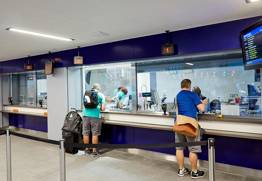
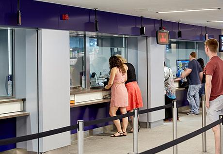
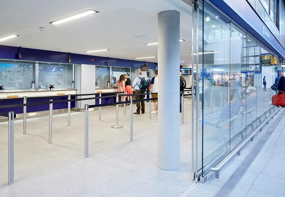
Ideas worked closely with Network Rail to produce a set of design guidelines for ticket counters to be implemented across the network. These guidelines now form the base design for all of Network Rail’s Inclusive Ticket Counters and are to be used for all railway investment and enhancement projects that involve a new ticket counter from GRIP stage 3 onwards (‘option selection’) – part of Network Rail’s management and control process. The purpose of the Guidelines document is to ensure compliant designs, and to avoid abortive work and costs on new ticket office projects, and reflects Network Rail’s aspiration for an inclusive and user friendly solution.
WHY WAS THIS NEEDED?
Network Rail wanted to “ensure facilities are suitable for every passenger and staff member for accessibility, ergonomics, design, finishes and functionality”. Many ticket counter installations were surveyed by Network Rail, and this exercise identified that most had inherent flaws and misguided design solutions. They found a plethora of inappropriate designs, and situations where there had been constant redesign, errors, mistakes and escalating project costs. It became apparent that many installed counters had adopted crazy and bizarre concepts, rather than a practical and inclusive design approach.
IDEAS RESPONSE TO THE PROBLEM
The Network Rail survey identified one design which stood out, and that was from Ideas. Our unique product wholly embraces the idea of a fully inclusive and well-considered design, and does not compromise on style. Ideas were invited by Network Rail to discuss our standard ticket office design for the Crossrail Programme, and then asked to produce a concept design and prototype for the Crossrail Stations. These were reviewed by train operating staff for their feedback and comments and they were also assessed by representatives from architectural and ergonomics teams, accessibility groups and experts.
Key features of the inclusive design we prepared are:
- our dual height counter design which provides uniform counter heights and continuous counters
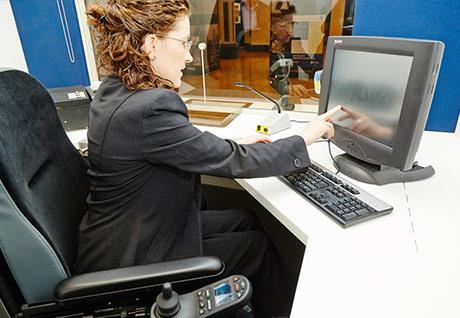
- all transaction windows are accessible by both ambulant standing and wheelchair users and people of lower stature
- introducing an unique transaction tray for dual height counters – the DFA Cash Tray
- positioning the Chip & PIN machine on an extendable arm, so it can be easily used by both standing and seated customers


"Ideas has worked closely with Network Rail to produce a set of design guidelines for ticket counters, to be implemented across the network."